Spaces:
Sleeping

Sleeping
File size: 11,211 Bytes
5d64005 |
1 2 3 4 5 6 7 8 9 10 11 12 13 14 15 16 17 18 19 20 21 22 23 24 25 26 27 28 29 30 31 32 33 34 35 36 37 38 39 40 41 42 43 44 45 46 47 48 49 50 51 52 53 54 55 56 57 58 59 60 61 62 63 64 65 66 67 68 69 70 71 72 73 74 75 76 77 78 79 80 81 82 83 84 85 86 87 88 89 90 91 92 93 94 95 96 97 98 99 100 101 102 103 104 105 106 107 108 109 110 111 112 113 114 115 116 117 118 119 120 121 122 123 124 125 126 127 128 129 130 131 132 133 134 135 136 137 138 139 140 141 142 143 144 145 146 147 148 149 150 151 152 153 154 155 156 157 158 159 160 161 162 163 164 165 166 167 168 169 170 171 172 173 174 175 176 177 178 179 180 181 182 183 184 185 186 187 188 189 190 191 192 193 194 195 196 197 198 199 200 201 202 203 204 205 206 207 208 209 210 211 212 213 214 215 216 217 218 219 220 221 222 223 224 225 226 227 228 229 230 231 232 233 234 235 236 237 238 239 240 241 242 243 244 245 246 247 248 249 250 251 252 253 254 255 256 257 258 259 260 261 262 263 264 265 266 267 268 269 270 271 272 273 274 275 276 277 278 279 280 281 282 283 284 285 286 287 288 289 290 291 292 293 294 295 296 297 298 299 300 301 302 303 304 305 |
<!DOCTYPE html>
<html>
<head>
<title>Introduction to Data Science Programming in Python</title>
<meta http-equiv="Content-Type" content="text/html; charset=UTF-8"/>
<style type="text/css">
@import url(https://fonts.googleapis.com/css?family=Yanone+Kaffeesatz);
@import url(https://fonts.googleapis.com/css?family=Droid+Serif:400,700,400italic);
@import url(https://fonts.googleapis.com/css?family=Ubuntu+Mono:400,700,400italic);
body { font-family: 'Droid Serif'; }
h1 {
font-family: 'Yanone Kaffeesatz';
font-weight: normal;
color:darkslategrey;
}
h2, h3 {
font-family: 'Yanone Kaffeesatz';
font-weight: normal;
}
.font40 {
font-size: 40px;
}
.font30 {
font-size: 30px;
}
.font20 {
font-size: 20px;
}
.remark-code, .remark-inline-code {
font-family: 'Ubuntu Mono';
font-size: 20px;
}
/* Two-column layout */
.left-column {
color: #777;
width: 50%;
float: left;
}
.left-column h2:last-of-type, .left-column h3:last-child {
color: #000;
}
.right-column {
width: 50%;
float: right;
padding-top: 1em;
}
.right-column h2:last-of-type, .right-column h3:last-child {
color: #000;
}
.inverse {
background: #272822;
color: #e4e4e1;
text-shadow: 0 0 20px #333;
}
.inverse h1, .inverse h2, .inverse h3 {
color: #f3f3f3;
line-height: 0.8em;
}
.lightfont {color:rgb(129, 126, 126);
</style>
</head>
<body>
<textarea id="source">
class: center, middle, font30
# Introduction to Streamlit Apps
J. Hathaway - Data Science Program Chair (BYU-I)
---
class: font30
# Disclaimers
## Dashboarding is easy to start with modern tools like Streamlit.
### It is much harder to implement as [Full-Stack Developer](https://aws.amazon.com/what-is/full-stack-development) has it's own schooling and employment. Enjoy using these tools. However, know their purpose and use them accordingly.
---
class: font20
# Agenda
Exemplify the data science process - Extract, Transform, Load, Analyze
1. Checking installations (1 minute)
2. Creating an account and navigating Hugging Face (10 minutes)
3. Docker for dashboard development using Streamlit (10 minutes)
4. Polars for data munging (5 minutes). _Don't munge data in your app (unless you have to)!_
5. What are dashboards? (5 minutes)
6. Why Streamlit for dashboards? (10 minutes)
7. Visualization in dashboards (5 minutes)
8. Tables in dashboards (5 minutes)
9. Key Performance Indicators [KPIs] in dashboards (5 minutes)
10. Challenge yourself to some dasbhoard edits (20 minutes)
---
class: font40
# Checking our installation
1. [Python Installed](https://www.python.org/downloads/)
2. [VS Code Installed](https://code.visualstudio.com/download)
3. [Python VS Code Extension Installed](https://marketplace.visualstudio.com/items?itemName=ms-python.python)
4. [Docker Installed](https://www.docker.com/)
4. Python packages installed.
```python
pip install polars plotly streamlit
```
---
class: font20
# Hugging Face Accounts and Navigation
## [Create your Hugging Face](https://huggingface.co/join) account.
> The platform where the machine learning community collaborates on models, datasets, and applications.
- [Hugging Face Docs](https://huggingface.co/docs)
- [Hugging Face Spaces](https://huggingface.co/docs/hub/spaces) ([Youtube Intro](https://www.youtube.com/watch?v=3bSVKNKb_PY))
- [Hugging Face Repositories](https://huggingface.co/docs/hub/repositories)
- [Hugging Face Organizations](https://huggingface.co/docs/hub/organizations)
---
class: font20
# Docker for Dashboard Development
.left-column[
1. Clone our Hugging Face repository
2. Explore the `DockerFile` and `docker-compose.yml` files.
3. Running `Docker compose up`
4. Editing our App
5. Pushing our changes
]
.right-column[

]
---
class: font20
# Polars for data munging
> Polars is a lightning fast DataFrame library/in-memory query engine. Its embarrassingly parallel execution, cache efficient algorithms and expressive API makes it perfect for efficient data wrangling, data pipelines, snappy APIs and so much more. Polars is about as fast as it gets, see the results in the [H2O.ai benchmark](https://h2oai.github.io/db-benchmark/).
> </br>
> [Polars Website](https://www.pola.rs/)

---
class: font20
# Introduction to Dashboarding (Structured design)
> A dashboard is a way of displaying various types of visual data in one place that let's the user focus on one general topic but explore questions within that topic.

---
class: font20
# Introduction to Dashboarding (Audience)
> A dashboard is a way of displaying various types of visual data in one place that let's the user focus on one general topic but explore questions within that topic.
> A poorly-designed dashboard doesn’t respect the reader’s time. The whole point of a dashboard is to create a product that will save the user’s time by including everything they need to know in one place. If they can’t go through the dashboard in a couple of minutes and get on with their job, the design needs to be changed.

[Reference 1](https://www.vmwareopsguide.com/dashboards/chapter-1-design-considerations/3.1.2-the-art-of-dashboard/) and [Reference 2](https://databox.com/bad-dashboard-examples)
---
class: font20
# Why Streamlit for dashboards?
Streamlit turns data scripts into shareable web apps in minutes in pure Python. A faster way to build and share data apps with no front‑end experience required.

---
class: font30
# Streamlit programming
Now let's practice using Streamlit with our installation of Python
__Streamlit practice (streamlit_try.py)__
_After deleting your Docker Image and Container, edit your `DockerFile` to build from a new `streamlit_try.py` script that you create in the folder. Use the code below for the app._
```python
import streamlit as st
import polars as pl
st.write("Here's our first attempt at using data to create a table:")
st.write(pl.DataFrame({
'first column': [1, 2, 3, 4],
'second column': [10, 20, 30, 40]
}))
```
---
class: font20
# Introduction to Data Visualization
Our eyes are drawn to [colors and patterns](https://www.tableau.com/learn/whitepapers/tableau-visual-guidebook). We can quickly identify red from blue, and squares from circles. Our culture is visual, including everything from art and advertisements to TV and movies. Data visualization is another form of visual art that grabs our interest and keeps our eyes on the message.
.left-column[
### Advantages of data visualization:
- Easily sharing information.
- Interactively explore opportunities.
- Visualize patterns and relationships.
]
.right-column[
### Disadvantages:
- Biased or inaccurate information.
- Correlation doesn’t always mean causation.
- Core messages can get lost in translation.
]
[Tableau Reference](https://www.tableau.com/learn/articles/data-visualization)
---
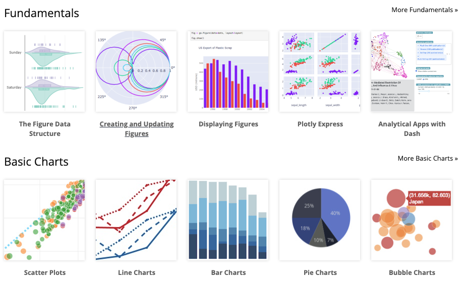
class: font20
# Introduction to __Plotly__ for Data Visualization
The Plotly Python package leverages the plotly.js JavaScript library to enables Python users to create beautiful interactive web-based visualizations. Plotly.js is built on top of d3.js and stack.gl, Plotly.js is a high-level, declarative charting library. plotly.js ships with over 40 chart types, including 3D charts, statistical graphs, and SVG maps.
---
class: font20
# Tables in dashboards
> Complexity is the downfall of dashboards. Raw data is always complex.
- [How to Fit Big Tables on Small Screens](https://www.youtube.com/watch?v=s7nvF1PuAWY)
- [Examples of great tables](https://posit-dev.github.io/great-tables/examples/)
---
class: font40
# Key Performance Indicators (KPIs) in dashboards
> Too much summarization and too much dashboard real estate.
_[The Dark Side of KPIs: Uncovering the Limitations and Pitfalls](https://shahmm.medium.com/the-dark-side-of-kpis-uncovering-the-limitations-and-pitfalls-4139950e70ef)_

---
class: font20
# Streamlit Challenge Activity
- Add the ability to filter the chart to a specified year range with [st.date_input()](https://docs.streamlit.io/develop/api-reference/widgets/st.date_input)
- Add [Dataframes - st.data_editor()](https://docs.streamlit.io/develop/concepts/design/dataframes) to allow the user to pick which variables are displayed in the drop down.
- Add a few metrics to your dashboard using [st.metric()](https://docs.streamlit.io/develop/api-reference/data/st.metric)
- Report the year range of data available for the variable selected over all countries
- Add the percent growth from 2000 to the latest available year
- Add the country with the highest value in the latest year.
- Give the user of your app the ability to take a picture using [st.camera_input()](https://docs.streamlit.io/develop/api-reference/widgets/st.camera_input).
- Try to use a third party extension to allow the user to draw on the camera picture taken using [streamlit-drawable-canvas](https://github.com/andfanilo/streamlit-drawable-canvas?tab=readme-ov-file).
- Now organize your application using
- [st.set_page_config()](https://docs.streamlit.io/develop/api-reference/configuration/st.set_page_config)
- [st.columns()](https://docs.streamlit.io/develop/api-reference/layout/st.columns)
</textarea>
<script src="https://remarkjs.com/downloads/remark-latest.min.js" type="text/javascript">
</script>
<script type="text/javascript">
remark.macros.upper = function () {
// `this` is the value in the parenthesis, or undefined if left out
return this.toUpperCase();
};
remark.macros.random = function () {
// params are passed as function arguments: ["one", "of", "these", "words"]
var i = Math.floor(Math.random() * arguments.length);
return arguments[i];
};
remark.macros.scale = function (percentage) {
var url = this;
return '<img src="' + url + '" style="width: ' + percentage + '" />';
};
var slideshow = remark.create({
ratio: "16:9",
highlightLanguage: 'javascript',
highlightStyle: 'monokai'
});
</script>
</body>
</html>
|